


Past Branding: A Look Back
Happy Friday, friends.
As we get closer and closer to launching the new brand (coming Friday – October 7th), I thought it would be fun (albeit, embarrassing) to take a walk down memory lane and do a little blog post sharing the genesis and progression of our business branding. So sit back, relax and prepare yourself to judge me. 🙂
GENESIS
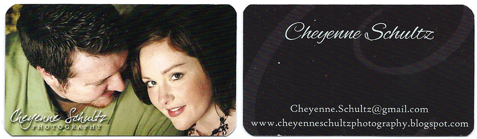
Oh goodness gracious, y’all. This is where it all started. I can vividly remember sitting next to Geoff at our rickety desk in the first apartment we shared together…dictating what was in my head for a logo and business card. It was fall of 2007 and we had just been married a few months earlier. And I think it killed a little piece of him as I asked him to use that drop shadow and three different fonts together. If you want a picture of love and a clue that we would make it in marriage…it was in that moment of graphic designing sacrifice. 🙂
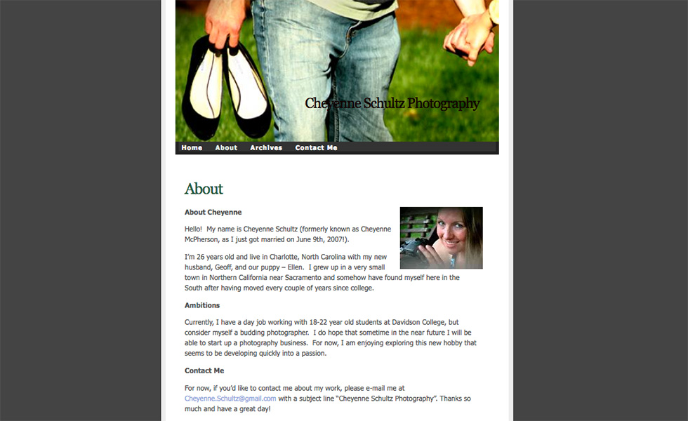
I started with a blog on blogspot. I SO wish I had taken a screenshot of it so I could share it here. What I do have, is a shot of a momentary lapse in judgement when I thought I could design my own wordpress blog. That didn’t last long and I quickly went back to my trusty blogger blog. What I love most about this is my “ambitions” statement in the “About” section:
“…consider myself a budding photographer. I do hope that sometime in the near future I will be able to start up a photography business. For now, I am enjoying exploring this new hobby that seems to be developing quickly into a passion.”
What an awesome reminder of God’s faithfulness, his plans for my future and how He has blessed me. 🙂
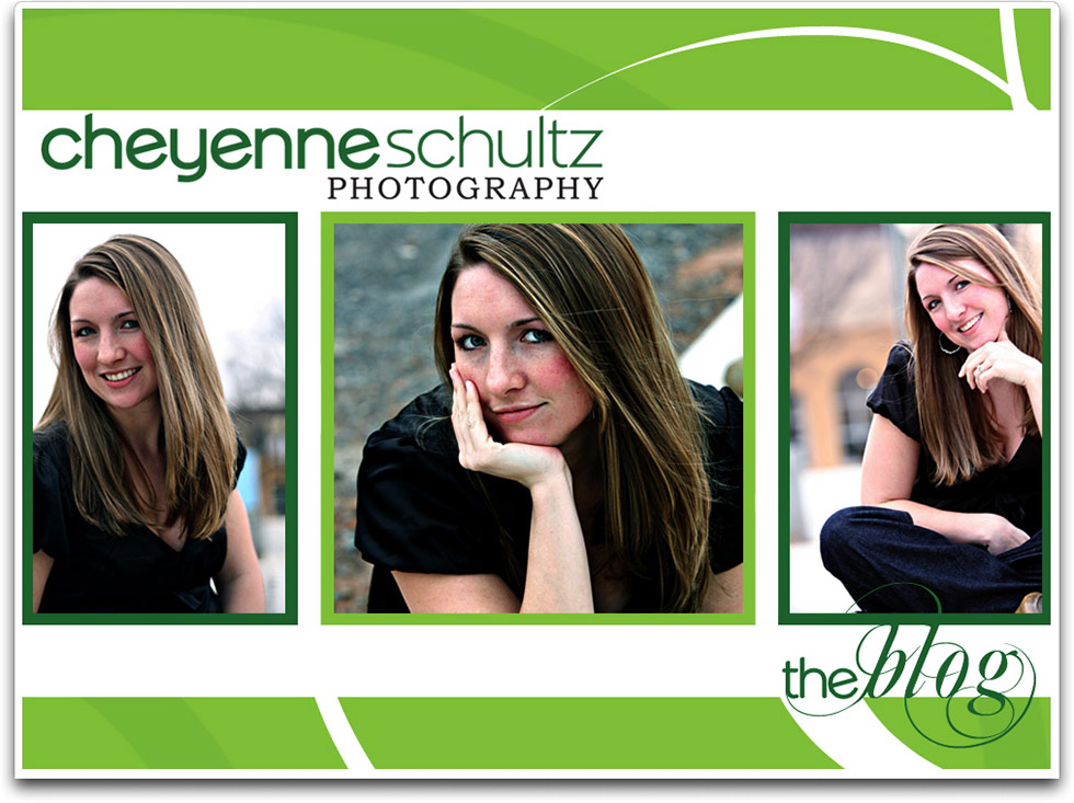
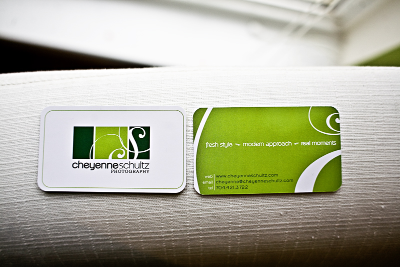
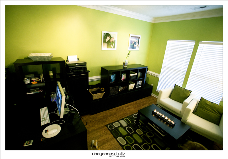
THE GREEN PERIOD
I was inspired to name this phase after Pablo Picasso’s “Blue Period”. This was certainly, my green period. I have no explanation for the green…other than…well, I just liked green. Great framework for a solid brand. Ha!
I will say, this first rebrand was the first time that I actually started to understand what branding was and how to do the basics. I didn’t quite grasp the concept yet that a brand should be built from a place of “why” and in attempt to reach a target market audience…but I did understand the benefits of pulling it through every facet and fiber of a business. Hence, GREEN EVERYWHERE….even the paint color on my office walls. No comment.
This particular logo was again dictated by me and designed by Geoff. I had seen a logo of an old housing development project in town, was inspired and requested that Geoff recreate the logo for us. Good job, Cheyenne. Way to be original.
I especially love (read: cringe over) our tagline: “fresh style, modern approach, real moments”. I still have the notebook I used when I was brainstorming for this and landed on those words. At the time, it was like “YESSSSS! This is BRILLIANT!”. You guys…I can’t. HA!
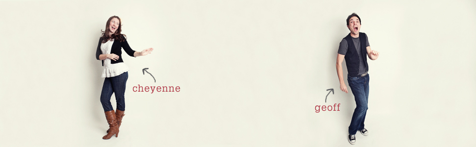
And how much do you love those headshots?!
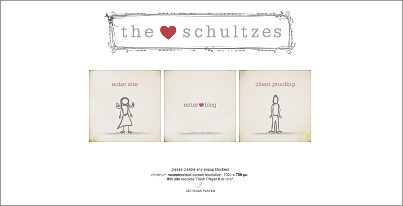
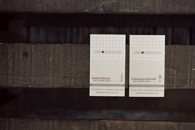
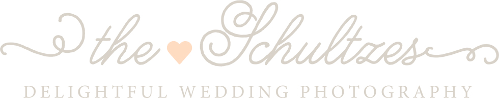
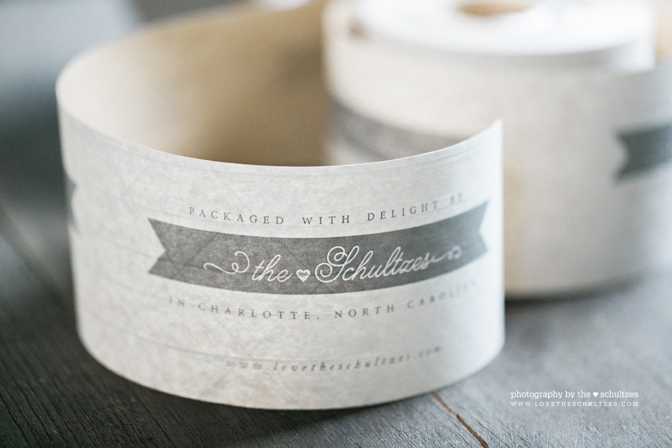
THE SCHULTZES
When we first started the business, it was my dream; my passion. Even though it wasn’t Geoff’s, he was always quick to support me in any way that he could. Including coming along with me to those early shoots when I was TER-IF-FIED and didn’t have any idea what I was doing. From there, it morphed into something that he and I really enjoyed doing together. We talked about it at length and ultimately decided to rebrand again and make three big changes. #1 – A new business name: The Schultzes, #2 – Get a customized blog and #3 – Hire a graphic designer. We launched for that first time as The Schultzes in winter of 2010…shortly after we found out we were pregnant with Boone.
One of the best decisions we made was hiring a professional designer (Erica of The Summer House) to take us through a process to discover who we were and who we wanted to reach. She helped us develop our first intentionally created brand and visual identity…and we loved it.
A fun fact about the day we launched this new brand. Despite many, many people having gone through the branding process with us and even seen our final logo, no one…including us…realized the grammatical error that was of our new name and logo: “The Schultz’s”. Of course, the day of the launch everyone made sure we knew of the mistake and we quickly made the change. You can see the error below in the intro animation Geoff designed for our website. Lessons learned: be better at grammar. 🙂
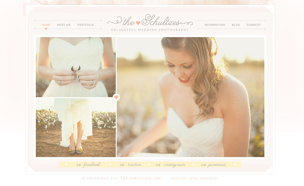
THE SCHULTZES VOL. 2
While rebranding to The Schultzes that first time really took our business to a new level, after a few years, we had changed, our priorities changed and we felt like there was room to better point our brand in a direction that we wanted to go. Our second rebrand of The Schultzes took place during a busy season of life: we had a toddler and a newborn, so things took much longer than expected to finalize. Such is life. We launched our new brand on Valentine’s Day 2014, which was also the same day as our daughter’s very first birthday. 🙂
CHEYENNE SCHULTZ
About a month ago we announced our big news that we would be shifting our brand back to where it all started. This time, while I am excited about its “prettiness factor”, I am more excited that the new Cheyenne Schultz brand has been built intentionally and with great purpose. Please plan on joining us on Friday – October 7th for the reveal.
Cheyenne Schultz
posted by
Leave a Reply to The Schultzes Cancel reply
JOIN THE LIST
fun in your inbox

this makes me laugh/so happy! BRING BACK THE GREEN!
LOL
Wow my old rooommate- was she your first client?
Yes…our first paid client that we didn’t previously know…thanks to you! 🙂
I literally remember looking at that Green Profile pic of yours thinking, “I really hope I get to be her friend one day. She’s so cool.” And look as us now 😉
Love you so much, friend. 🙂