Our Re-brand: Behind the Scenes
It’s Friday. Just ONE WEEK until the new website goes live and we get to share our new brand with the world.
I. Can’t. Wait.
Last week I shared a post where we took a walk down memory lane to look back at some of our past business brands. You can find that post here if you’d like to take a see…it was quite humorous. Today, I thought it would be fun to share a little “behind the scenes” of our rebrand and a glimpse at some of the logo concepts that didn’t quite make the cut. Fun, right? If you are a nerd like me, you agree that this is fun. 🙂
As I was preparing this post, I did a search in my inbox to review some of the early correspondence I had with the incredibly Meagan Tidwell, which is who designed our new logo. Y’all, it was May of 2015 that I initially reached out to her. Oh. My. Goodness. Proof that this re-brand has been SUCH a long time coming.
_______________________________________________________________________________________________
Ethereal.
Simple.
Purposeful.
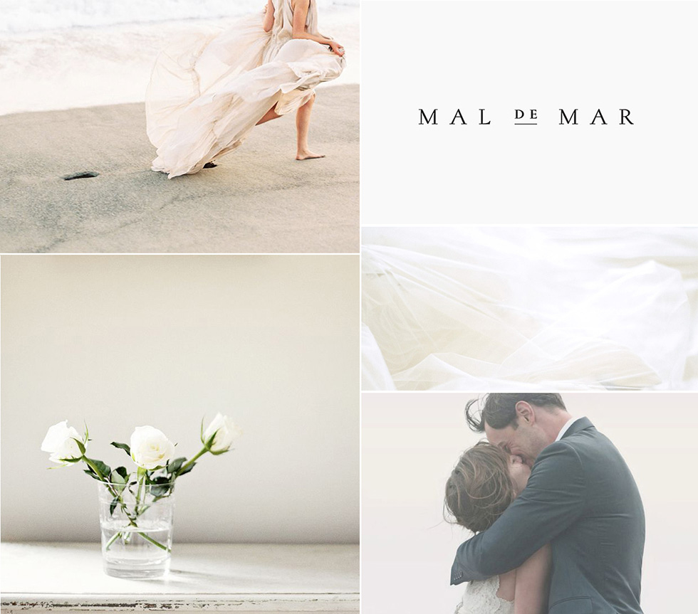
These were the words I used when Meagan asked me to provide three adjectives to pare down the information I had provided her through an initial questionnaire trying to communicate my vision for where our business was headed and the look and feel I was after. When she sent me this inspiration board in response, I was ecstatic. I just loved it and couldn’t wait to see this feel translated into our visual identity.

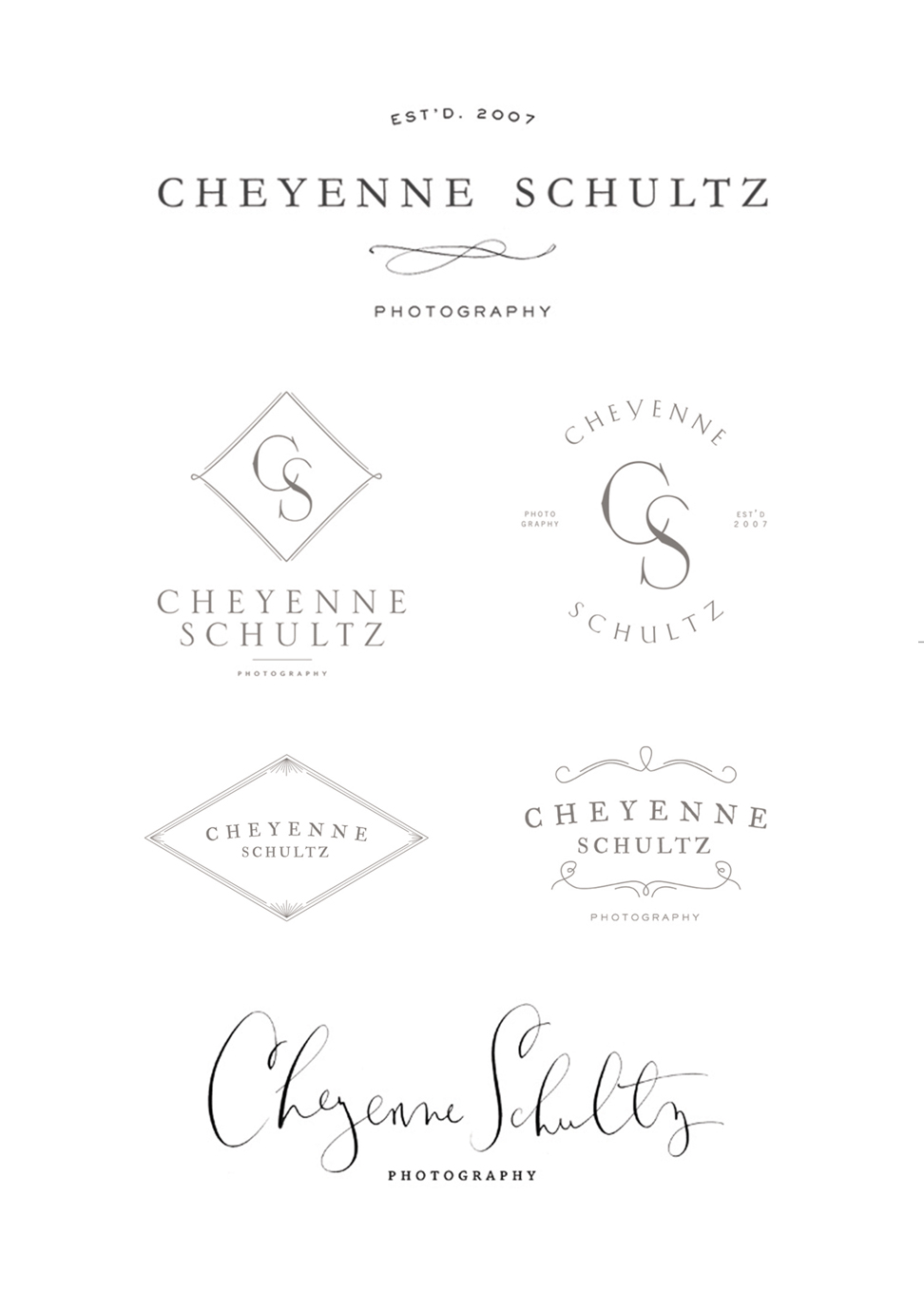
From there, Meagan got to work and soon sent over the first round of logo concepts. There were SO many great options; it was definitely difficult to first narrow them down to a few and then down to my favorite two and then my final selection for the direction I wanted to go. Here are a few of the logo concepts that we didn’t choose.

That’s all I can really share for now. In one week, all will be revealed. 🙂
Cheyenne Schultz
posted by
JOIN THE LIST
fun in your inbox